Good Design: the Difference Between "Bought" and "Sold"

Good Design: the Difference Between "Bought" and "Sold"
When we built our test case design tool, we thought:
-
When used thoughtfully, this test design approach is powerful.
-
The kinds of things going on "underneath the covers," like the optimization algorithms and combinatorial coverage risk confusing and alienating potential users before they get started.
-
Designing an easy-to-use interface is absolutely critical. (We kept in the "delighter" in our MVP release.)
-
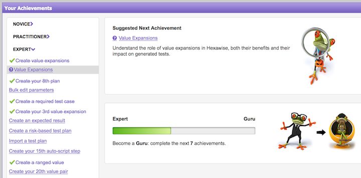
As we have continued to evolve, we've kept (a) focusing on design, and (b) having learned that customers don't find the tool itself hard to use but they do sometimes find the test design principles confusing, we've focused on adding self-paced training modules into the tool (in addition to training and help web resources and Hexawise TV tutorials.

Our original hope was that if we focused on design (and iterated it based on user feedback), that Hexawise would "sell itself." And that users would tell their friends and drive adoption through word of mouth. That's exact what we've seen.
We did learn that we needed to include more help getting started with the challenges of learning the test design principles needed to successful create tests. We knew that was a bit of a hurdle but we have seen it was more of a hurdle than we anticipated so we have put more resources into helping get over than initial resistance. And we have increased the assistance to clients on how to think differently about creating test plans.
A recent interview with Andy Budd takes an interesting look at the role of design in startups.
Andy Budd: Design is often one of the few competitive advantages that people have. So I think it’s important to have design at the heart of the process if you want to cross that chasm and have a hugely successful product. ... Des Traynor: If a product is bought, it means that users are so attracted to it, that they’ll literally chase it down and queue up for it. If it’s sold, it means that there are people on commission trying to force it into customer’s hands. And I find design can often be the key difference between those two types of models for business.
Andy: There’s a lot of logic in spending less money on marketing and sales, and more money on creating a brilliantly delightful product. If you do something that people really, really want, they will tell their friends.
As W. Edward Deming said in Out of the Crisis
Profit in business comes from repeat customers, customers that boast about your product and service, and that bring friends with them
The benefits of delighting customers so much that they help promote your product are enormous. This result is about the best one any business can hope for. And great design is critical in creating a user experience that delights users so much they want to share it with their friends and colleagues.
The article also discusses one of the difficult decision points for a software startup. The minimal viable product (MVP) is a great idea to help test out what customers actually want (not just what they say they want). This MVP is a very useful concept (pushed into many people's consciousness by the popularity of lean startup and agile software development).
MVP is really about testing the marketplace. The aim is to get a working product in people's hands and to learn from what happens. If the user experience is a big part of what you are offering (and normally it should be) a poor user experience (Ux) on a MVP is not a great way to learn about the market for what you are thinking of offering.
In my opinion, adding features to existing software can be tested in a MVP way with less concern for Ux than completely new software, but I imagine some would want the great Ux for this case too. My experience is that users that appreciate your product can understand the rough Ux in a mock up and separate the usefulness from the somewhat awkward Ux. This is especially true for example with internal software applications where the developers can directly interact with the users (and you can select people you know who can separate the awkward temporary Ux from the usefulness of a new feature).
Related: The two weeks of on-site visits with testing teams proved to be great way to: (a) reconnect with customers, (b) get actionable input about what users like / don’t like about our tool, (c) identify new ways we can continue to refine our tool, and even (d) understand a couple unexpected ways teams are using it. - Automatically Generating Expected Results for Tests in Hexawise - Pairwise and Combinatorial Software Testing in Agile Projects


