Karma, Context-Driven Usability Considerations, and Wireframing

Karma, Context-Driven Usability Considerations, and Wireframing
Context is Important in Usability Testing
As Adam Goucher recently pointed out, it is important to keep in mind WHY you are testing. Testing teams working on similar projects will have different priorities that will impact how much time they test, what they look for, and what test design methods they use. (Kaner and Bach provide some great specific examples that underscore this point here). In short, the context in which you're testing should impact how you test.
The same maxim holds true when you're conducting usability testing. Considering the context is important is well, both the context of the users of the application and the context of the application itself vis a vis other similar products. Important considerations can include:
-
What problem does the application solve for the user?
-
What does the application you're testing aspire to be as compared to competing applications?
-
Who is the target audience of the application? What differentiating features does the application have?
-
What is the "personality" of the application?
-
What benefits and values do specific segments of target users prioritize?
These questions are all important when you analyze a web site with an eye on usability. I would recommend combining both a "checklist" approach (e.g., Jakob Nielsen's well-known Ten Usability Heuristics) with an approach that takes context-specific considerations (such as the 5 questions listed above) into account.
The Context of a User Group I'm Familiar with: the Hexawise Team
As of the end of June, 2010, our website leaves a great deal to be desired, so say the least. Hexawise.com consists mainly of a single landing page with anemic content that we threw together a year ago thinking that we'd "turn it into a real site" when we got around to it. We then proceeded to focus all of our development efforts on the Hexawise tool itself as opposed to our website (which we've let fester). Apologies if you've visited our site and wanted to know more details about what our test design tool does and how it complements test management tools. To date, we haven't provided as much information as we should have.
We've kicked off a project now to right this wrong. To do so, we're drafting up new content and organizing our thoughts about how to present it to visitors. Our needs are relatively simple. We want to create a set of simple wireframes that will allow us to quickly experiment with a few design options, gather feedback from friends and target users. For us, ease of use is key. Quickly being able to use the tool (without needing to read through a user guide) is critical. Ability to use the tool without reading through user guides is a must. We also value a tool's ability to make it easy to collaborate with one another easily.
With that as background, what follows are some quick comments on a couple wireframing tools I've recently explored in the context of our preferences and values. Wireframing is the practice of creating a skeletal visual interface for software. It is used for the the purposes of prototyping, soliciting early user/client feedback. It comes before the more time consuming phases of design. Two popular wireframe creation tools are Balsamiq and Hotgloo. Both are flash applications. Balsamiq is a desktop app. Hotgloo is a SaaS tool used over the internet.
Balsamiq and HotGloo
The first thing that strikes me about Balsamiq is the rich library of UX elements neatly organized and accessible by category or through a quick add search box. Everything works as it should: the drag, drop, click and type interface follows the principle of least astonishment. Fortunately, ease of use doesn't preclude speed: modifying the content and structure of UX elements is text-based versus form-based - blending in a touch of UNIX command line efficiency into otherwise graphical interface. UNIX and IRC users will feel right at home.
HotGloo is a very promising wireframing tool. They have clearly taken a page from the 37 Signals product development playbook. They have made a tool with a smaller set of features that is very intuitive to use. They've avoided the potential risk of "feature bloat" by having fewer bells and whistles. Where I think they add value: as a SaaS tool, HotGloo is exceptionally good at allowing multiple members on a team to collaborate on iterative designs. Whereas Balsamiq uses traditional files, HotGloo is accessible from anywhere. HotGloo enables multiple users to chat and view mockups in real time. Only one user can make changes at a time. Feedback is very easy to give and I found their support to be exceptionally responsive.
HotGloo is easy to learn for the first time, but my designer felt frustrated how much time he had to spend tweaking little things (like changing the names and links of a tabbed window element). The element controller pop-ups got in the way of work and he found myself frequently dragging them away. Hotgloo also takes a more minimalist approach than Basalmiq with UX elements with respect to features. Whether this is a strength or a weakness to users is a matter of personal preference. The 37 Signals camp (which I am highly sympathetic to) argues that is often preferable to have fewer, easier-to-use features since the vast majority of users will not want or need too many bells and whistles. Our designer felt that Balsamiq's feature set fit his needs better. As a "meddlesome manager" who wants to provide regular input into the content for version 2.0 of our site, feature-richness is less important to me than the collaborative ability.
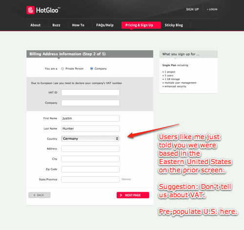
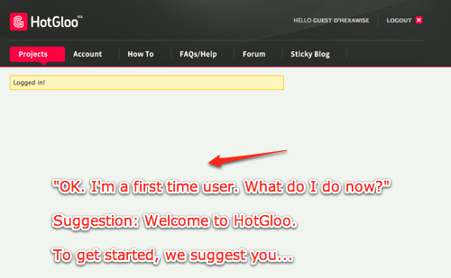
Usability Considerations I Shared with the Hotgloo Team


Balsamiq

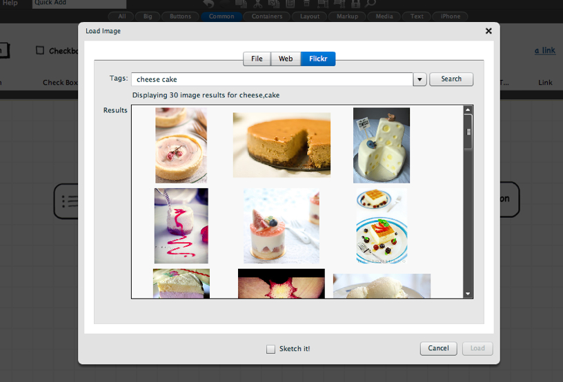
Balsamiq has a couple usability features that make it fun to use. A case in point is how you insert an image. Balsamiq gives you three choices, the third of which is really a nice touch: You can 1. Upload a file 2. Use a photo on the web or 3. Perform a flickr search right there and then without ever leaving comfort of the Balsamiq window. In my book, that kind of thoughtful workflow integration is what makes a good product great.
"Postscript" - Good Karma and an Open Invitation


As a post-script of sorts, after sending 5 UX suggestions (including the 2 above) to the HotGloo team last week, I received 5 outstanding UX suggestions for our Hexawise tool this week - out of the blue - from Janesh Kodikara, a new Hexawise user based in Sri Lanka. In addition, the HotGloo team provided 5 excellent UX suggestions for improving our tool as well. Taken together, they are some of the best suggestions we've had to date. If anyone reading this would be willing to share your usability suggestions with us, I can assure you, we're extremely interested in hearing your ideas.


